• This site contains eBay affiliate links for which Sea-Doo Forum may be compensated.

New Website Theme for SeaDoo Forum...

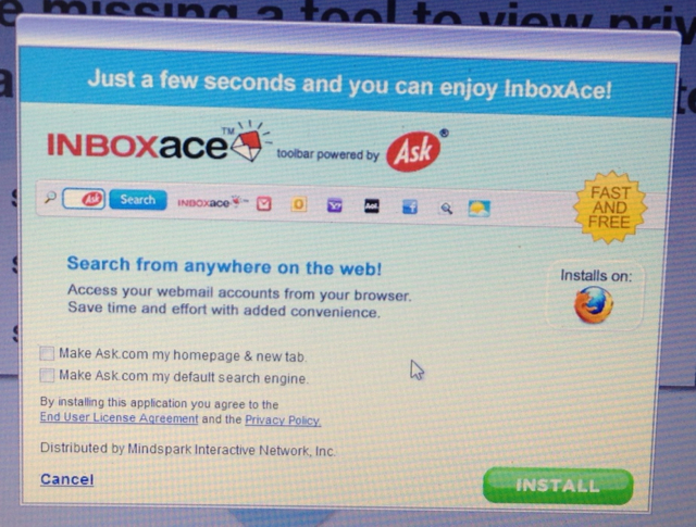
When installing the "INBOXACE"add-on, there are two clickable boxes. Un-click them if you do NOT want to change your default search home page and or make ASK your "New Tab" display page.

If you have already downloaded it and your pages have changed, go to CONTROL PANEL, PROGRAMS and find them within the list that populates. Click on them and then click UNINSTALL..

Here is a screen shot of the add-on.

80.jpg

DO NOT INSTALL INBOXACE, IT'S MALWARE, AND NOT PART OF THE UPGRADE, CLICK ON THE "X" TO DELETE THE ADD!!!!

Lou
 
LOL, now I just need [MENTION=47626]Seadoobuddy[/MENTION] to fix his avatar
81.jpg
and my day will be complete! Yes, my day to day standards are that low, if I wake up breathing I know I'm in for a great day.

:) Your not going to like it when i go to you're house, and take what's over there in that them garage of yours. :)

So far today's changes are good. YES, the top panel could be smaller.
 
I don't know and this maybe temporary, but the watercraft owned is not showing up in the user profiles.

Lou
 
I'd like the main center pane to be wider, I have a 22" monitor and it's like looking at a 14" monitor. Also can it be centered? What I mean is the SDF logo/home in the top left is narrower than the Welcome, racerxxx block on the top right.
 
You can see the offset.


EDIT: Deleted attachement

Sent from my SGH-T889 using Tapatalk 2
 
Last edited by a moderator:
When installing the "INBOXACE"add-on, there are two clickable boxes. Un-click them if you do NOT want to change your default search home page and or make ASK your "New Tab" display page.

If you have already downloaded it and your pages have changed, go to CONTROL PANEL, PROGRAMS and find them within the list that populates. Click on them and then click UNINSTALL..

Here is a screen shot of the add-on.

80.jpg

What page are you seeing the link for this? I don't see it at all and it shouldn't be there.
 
What page are you seeing the link for this? I don't see it at all and it shouldn't be there.

When you log in for the first time it says you need to download this to see your inbox.

It IMPLIES that it is required from the site. However, it seems it is a 3rd party issue...
I downloaded it already. It is not a virus issue, but it is a malware issue.
 
Is it ON the website or in one of the ad spaces? Trying to figure out where this would be embedded...

Do you have the actual link URL?
 
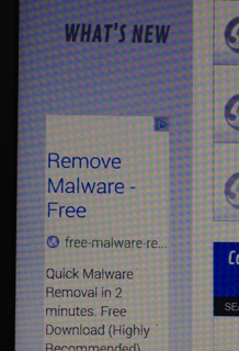
It's in the add space, but it's hard to tell because it's just under the left hand tabs. I did it too, it appears to be a requirement, but it's actually a pop up add. I'm glad to know I'm not the only dumb ass (sorry Kevin) that installed it. BTW Malwarebytes will get rid of it.

Lou
 
Last edited by a moderator:
Is it ON the website or in one of the ad spaces? Trying to figure out where this would be embedded...

Do you have the actual link URL?

Logged out and logged back in to see if I could figure it out.. I will upload a pic right after this. It is in an add space I would say, but the first time you see it, it does not look like that as it comes up on the page and says you NEED TO DOWNLOAD THIS TO SEE YOUR MAIL....

The same add is not in this picture but the INBOXACE add was in the same location,,,

85.jpg
 
It's in the add space, but it's hard to tell because it's just under the left hand tabs. I did it too, it appears to be a requirement, but it's actually a pop up add. I'm glad to know I'm not the only dumb ass (sorry Kevin) that installed it. BTW Malwarebytes will get rid of it.

Lou

No apology needed,,, I was the dumb ass... LOL

Working on removing it now...
 
Disclaimer: Did not read entire thread.

There is some code showing at the top.

<.vb:if condition="$show['member']"> <./vb:if>

I do not like the summary navigation on the left, makes the screen too cramped and then everything moves around when you go into a thread.
 
Ok,, found the proper way to remove (not disable as you want it removed, not disabled) INBOXACE from both Firefox and IE.

It will take a few moments and I will add all instructions to THIS post. That said, I will post this and add to it as I go...

Bear with me for a few minutes....

How to remove extensions and themes

At the top of the Firefox window, click on the Firefox button (top left), and then click Add-ons. The Add-ons Manager tab will open.
In the Add-ons Manager tab, select the Extensions or Appearance panel.
Select the add-on you wish to remove.
Click the Remove button.
Click Restart now if it pops up. Your tabs will be saved and restored after the restart.

You will see the INBOXACE add on right on top. Far right side click REMOVE.

86.jpg


For Internet Explorer
Open the desktop, and then tap or click the Internet Explorer icon on the taskbar.
Tap or click the Tools button Tools button, and then tap or click Manage add-ons.

Under Show, tap or click All add-ons, and then select the add-on you want to delete.

If the add-on can be deleted, you'll see the Remove option. Tap or click Remove and then tap or click Close.
 
Last edited by a moderator:
I do not like the summary navigation on the left, makes the screen too cramped and then everything moves around when you go into a thread.
\\

Working on a few of these things.. but what do you mean everything moves around when you go into a thread?
 
Sorry about this inboxace stuff guys. We have blocked them from advertising with us.
 
\\

Working on a few of these things.. but what do you mean everything moves around when you go into a thread?

On some pages, the sub menu (menu below the main header) has the words in one order but in a different order on a different page.

I assume that is what he is referring to..
 
Last edited by a moderator:
The top drop downs are working sweet now, before they were doing the up and downs when you were trying to move over them. Sorta like the old dollar bill on the fishing line. Looking good guys!!!!!!!!!!!!!!!
 
\\

Working on a few of these things.. but what do you mean everything moves around when you go into a thread?

On some pages, the sub menu (menu below the main header) has the words in one order but in a different order on a different page.

I assume that is what he is referring to..

That too. However I was referring the the body section of the thread list (in pink).

When selecting SUBSCRIBED which happens to be my default shortcut, it introduces the user settings panel (yellow). Selecting other nav or a thread and it goes away, sliding the thread list over.

Losing the header and left nav during scroll is also counter to popular design and cumbersome to scroll back up to.

IMHO, everything inside the green boxes should stay on the screen when scrolling. Whether or not the left nav is taken out and put on the top is debatable. Consistency is key to a good user interface. I'm not a web designer, but I did stay at a Holiday Inn once.

FWIW, I'm using Firefox ESR.

The screen grab/edit utility is greenshot and it rocks.


2014-04-03 14_54_34-Subscriptions - Seadoo Forums.jpg

2014-04-03 14_55_20-Search Results - Seadoo Forums.jpg
 
Last edited by a moderator:
Pink, Green, yellow.....all i see is blue, dark blue and black...the boxes at the top...is that what he means?


That too. However I was referring the the body section of the thread list (in pink).

When selecting SUBSCRIBED which happens to be my default shortcut, it introduces the user settings panel (yellow). Selecting other nav or a thread and it goes away, sliding the thread list over.

Losing the header and left nav during scroll is also counter to popular design and cumbersome to scroll back up to.

IMHO, everything inside the green boxes should stay on the screen when scrolling. Whether or not the left nav is taken out and put on the top is debatable. Consistency is key to a good user interface. I'm not a web designer, but I did stay at a Holiday Inn once.

FWIW, I'm using Firefox ESR.

The screen grab/edit utility is greenshot and it rocks.


View attachment 24394

View attachment 24395

Great suggestions.. we will look into these.
 
O.K., Greg and Joe,

This comes hard for me to say as normally I'm not a person to embrace change. But I think you have hit a home run here, the site is more streamlined, seems to load faster and easier to navigate, now that you have the bugs worked out or at least most of them, I really think you've got a winner. C O N G R A T U L A T I O N S !!!!!! And thank you for all the hard work.

And BTW, in case anyone needs a reminder. G O C A T S ! ! !

:hurray: :hurray: :hurray:

Lou
 
Last edited by a moderator:
Also,

No sooner than I posted the first time, the vb code went away. Perhaps it was a one time thing.

Cheers!
 
Back
Top